Secret Escapes
Product page redesign
Increased the usability and success metrics of key user tasks by redesigning the Secret Escapes product page.
About
The Secret Escapes product page receives the highest traffic out of all other pages on the website. Historically, any big changes in this space have been always challenging to introduce due to the multi-layered legacy processes within the company. This redesign was proposed with consideration of both technical and process challenges and resulted in a plan for incremental improvements that lead to the north star vision of what the product page should be catering for.
Key Decisions
Compiling recent and past research into one view over the cusomer journey helped all stakeholders share understnading of the scale of the problems.
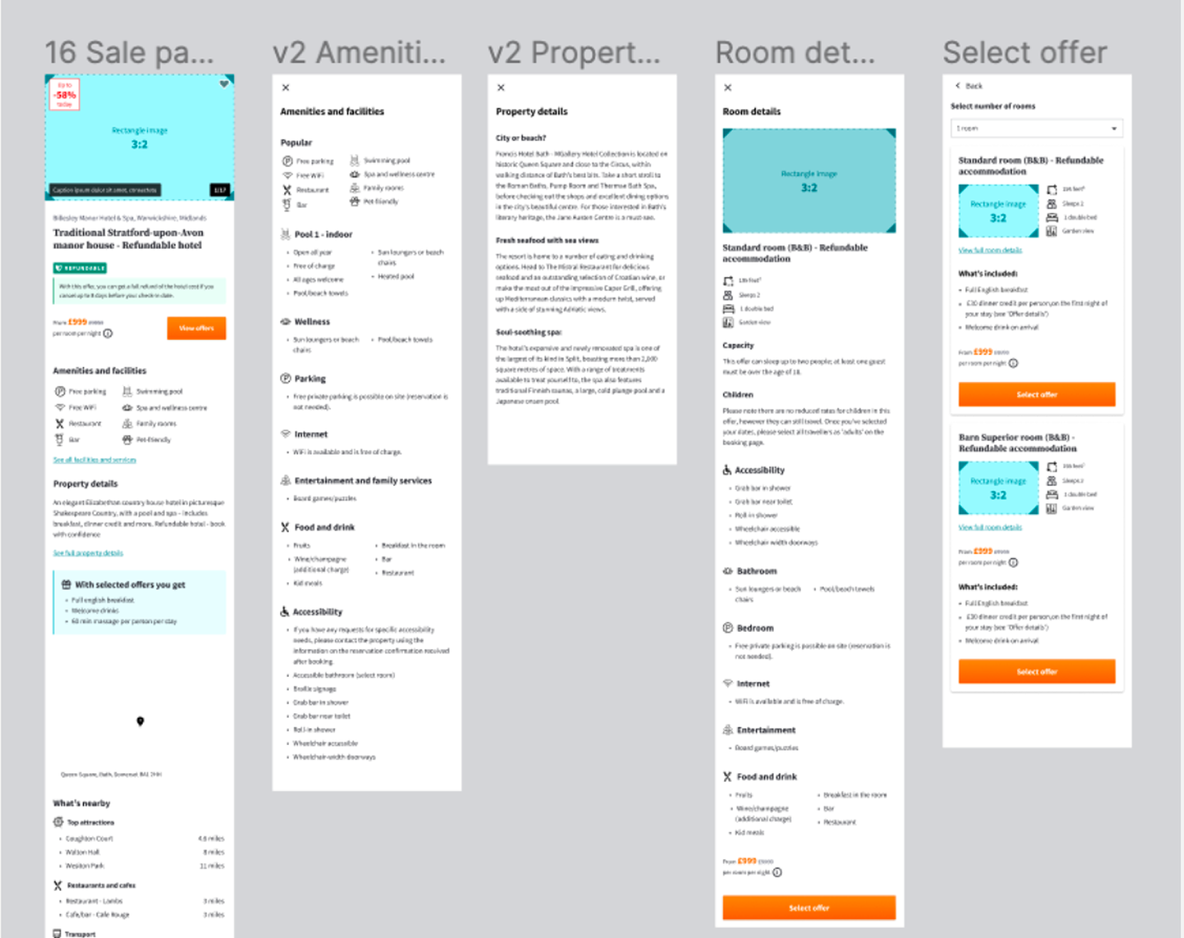
Finding a way to structure the content which came from a legacy CMS was key in order to make meaningful progress fast.
Comparing the production experience to the new design was the last piece of work that really highlighted the success of the improvements and helped prioritise the delivery work.
Process
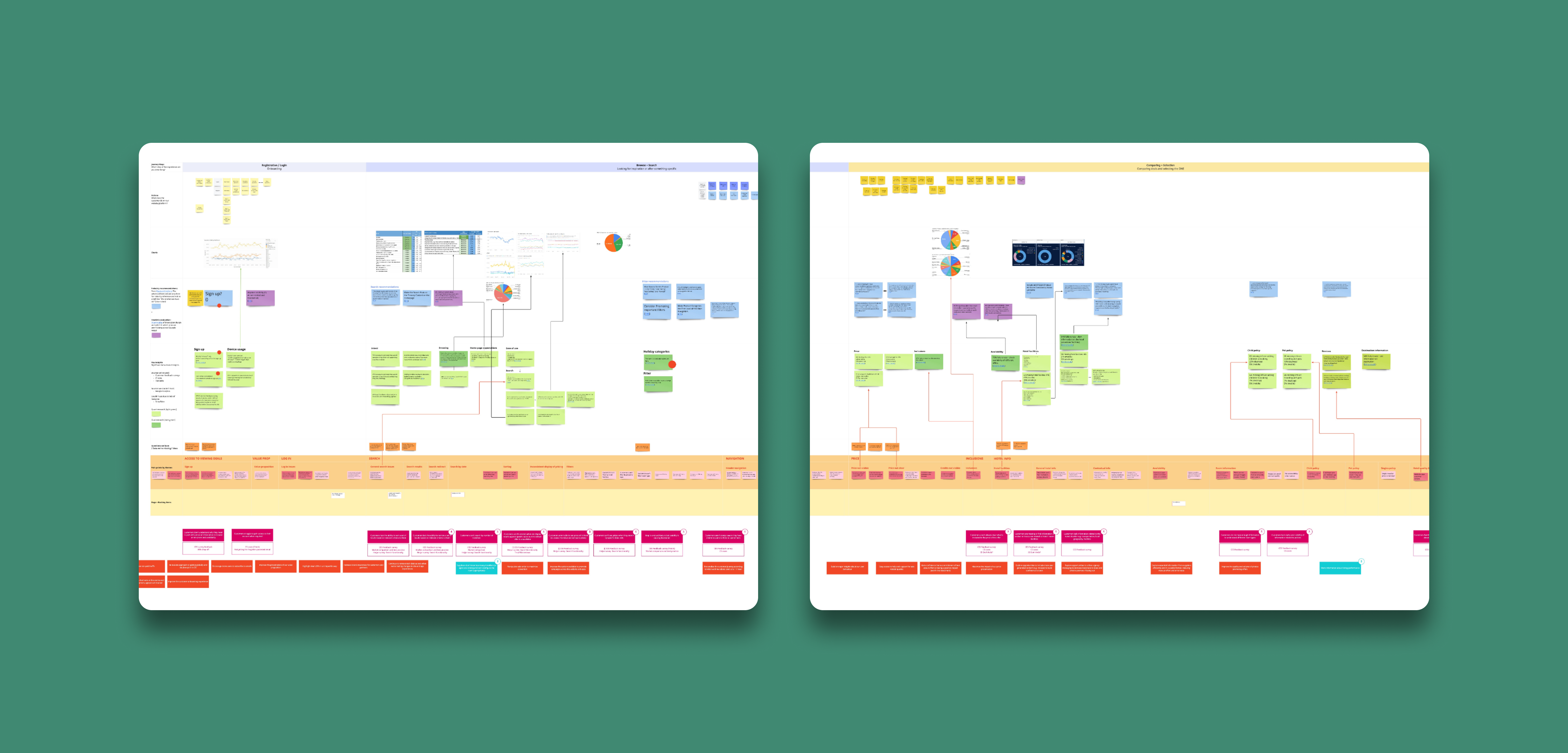
1. Past research insights synthesised
All the research previously carried out in the product page space was collected in one view — user insights map. The map visualised the main user journey and known pain points backed up by qualitative and quantitative data. Having all insights plotted within the context of the users' journey helped represent the significance of each issue.
2. Heuristic evaluation of the product page
Every key area of the product page was then evaluated using the 10 principles of interaction design. This evaluation was a helpful educational piece that helped the business better understand the user issues we were observing.
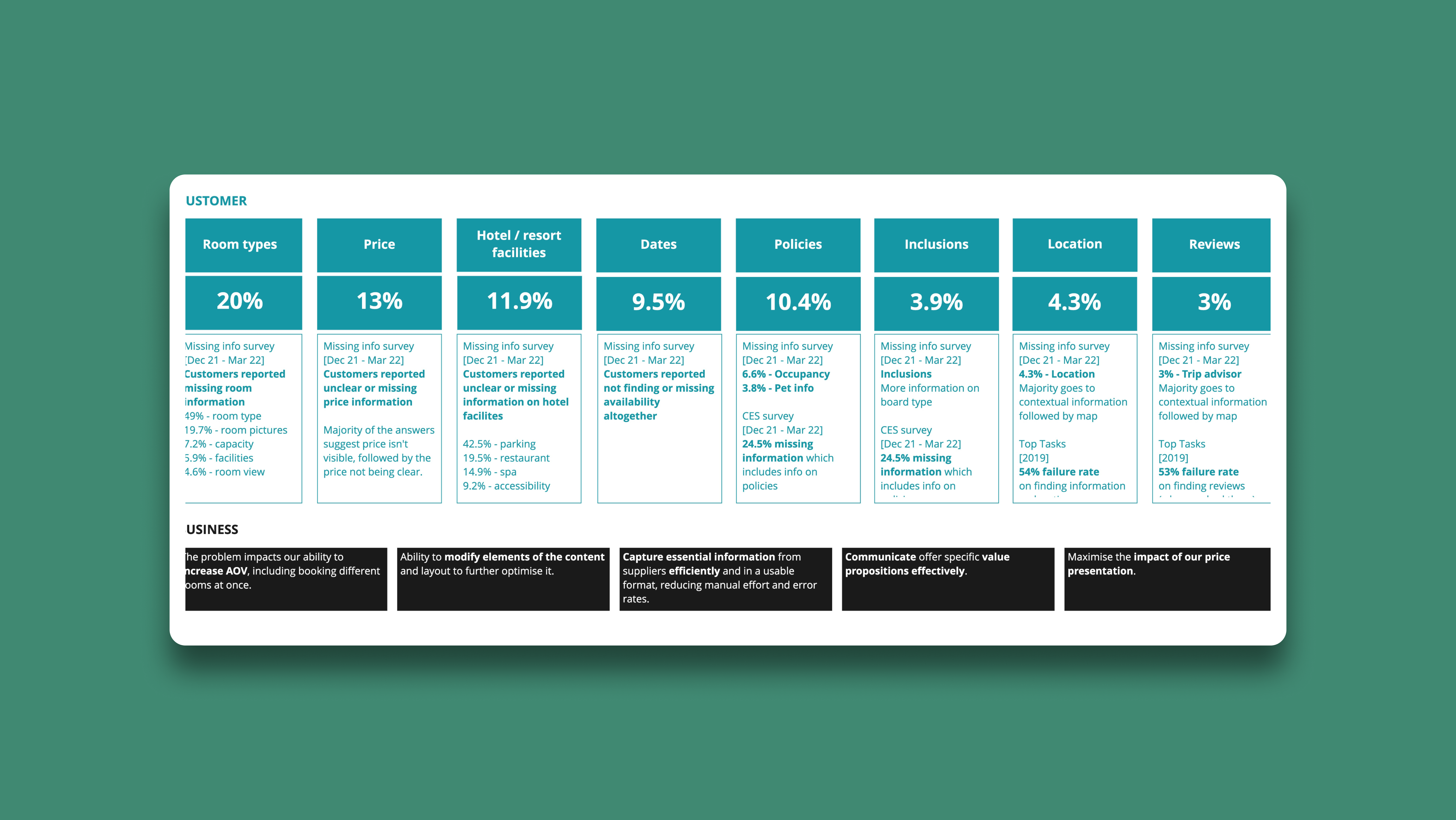
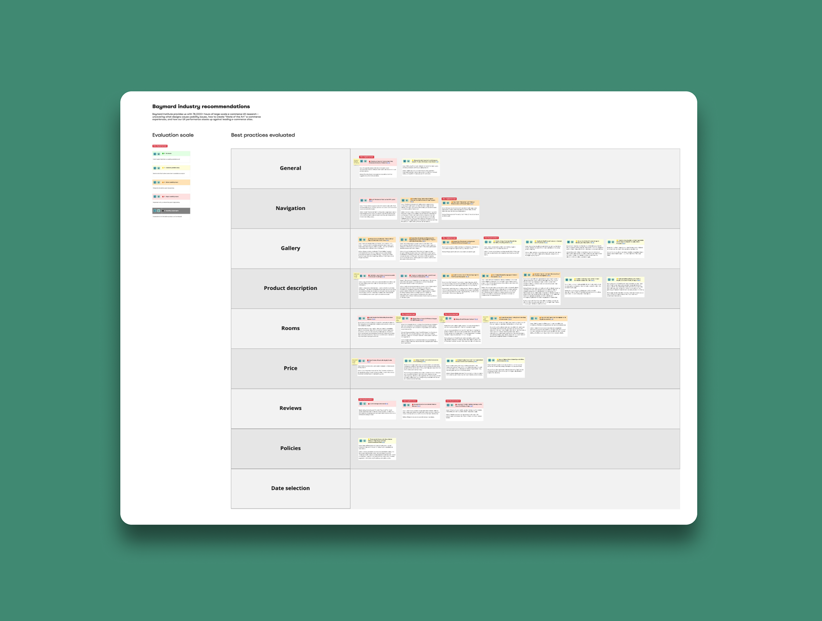
3. Industry recommendations
Using Baymard Institute as a resource, I collected all the relevant recommendations for best practices when it comes to buying holidays online. Again, this backed up the research findings and helped us understand user expectations and where we weren't meeting those.
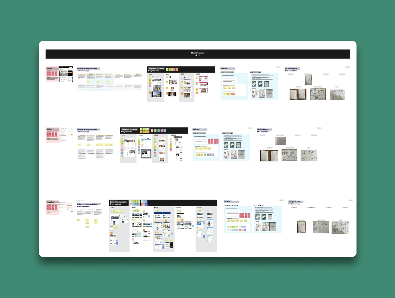
4. Ideation workshop on each problem space
With the research carried out, I was able to put specific critical areas of the product page forward for ideation. Using the insights, I designed a workshop that produced multiple ideas, which later were prioritised and used to create the new product page prototype.
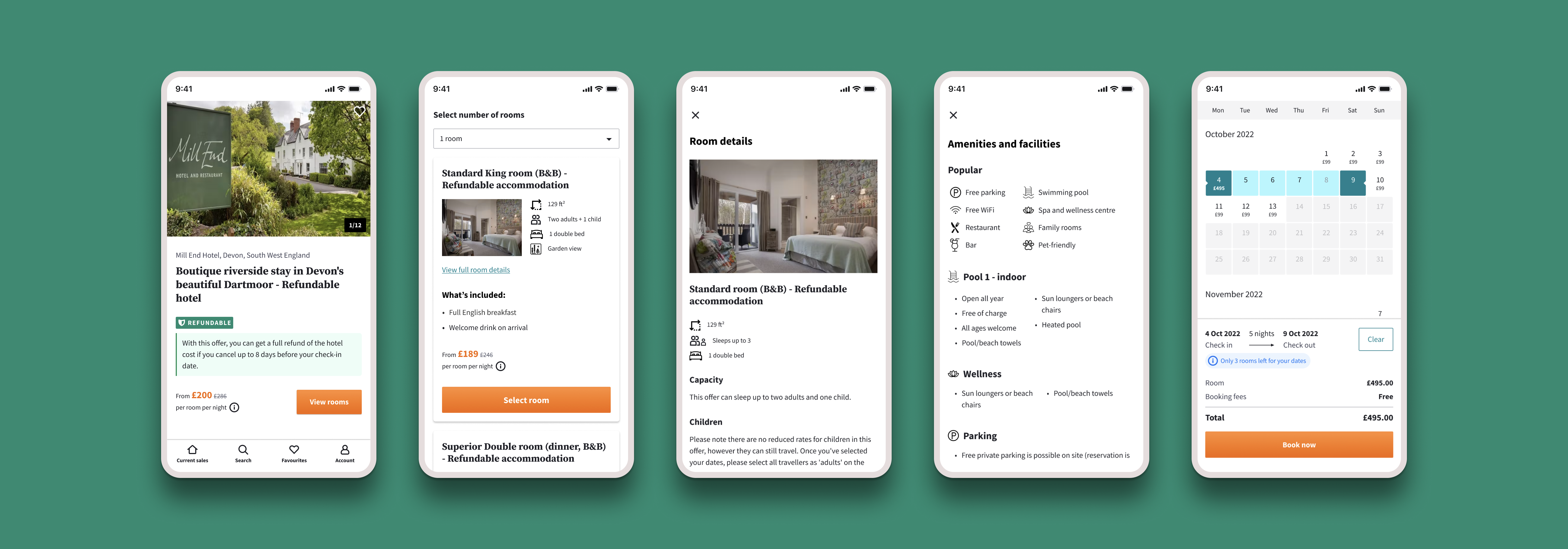
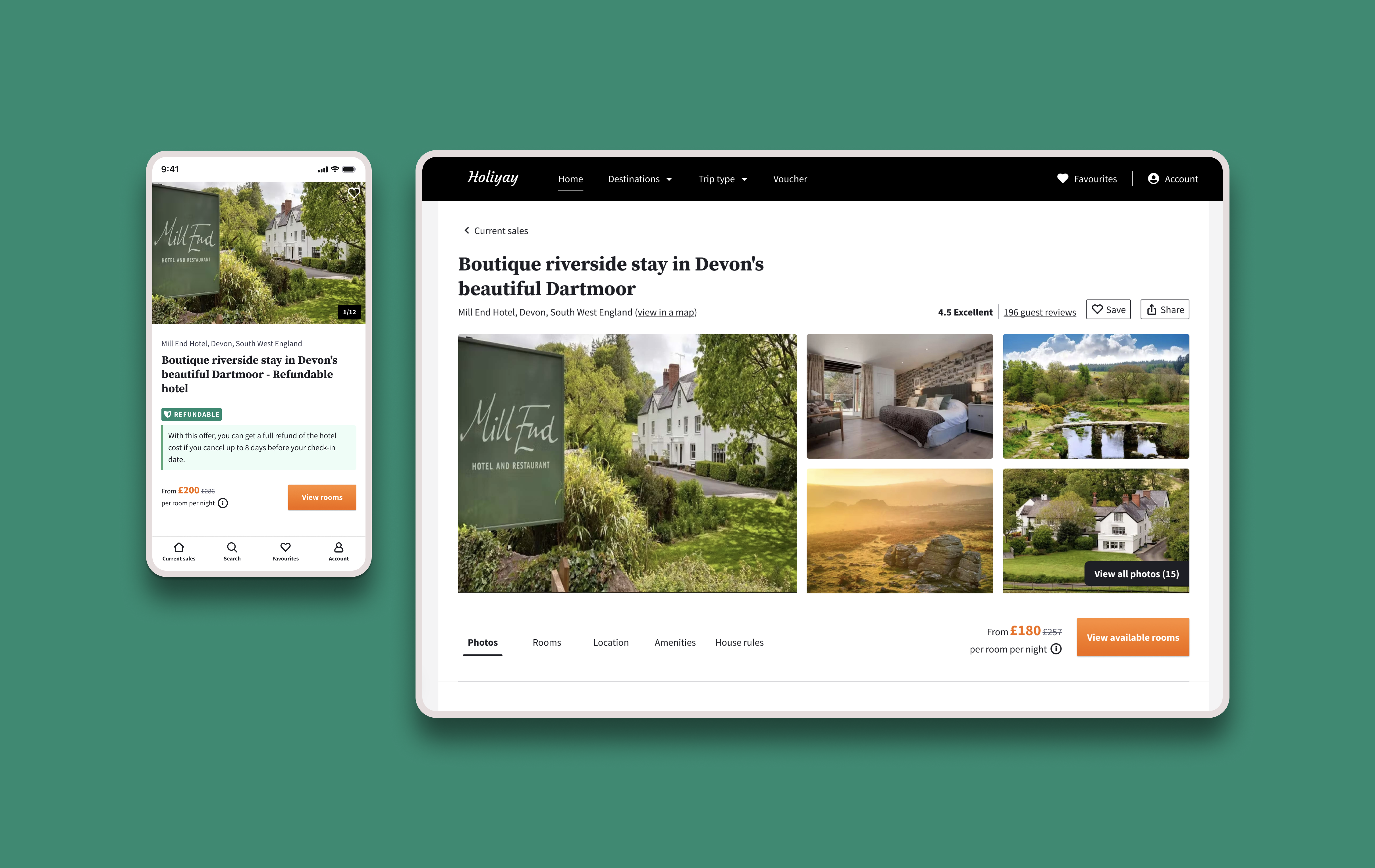
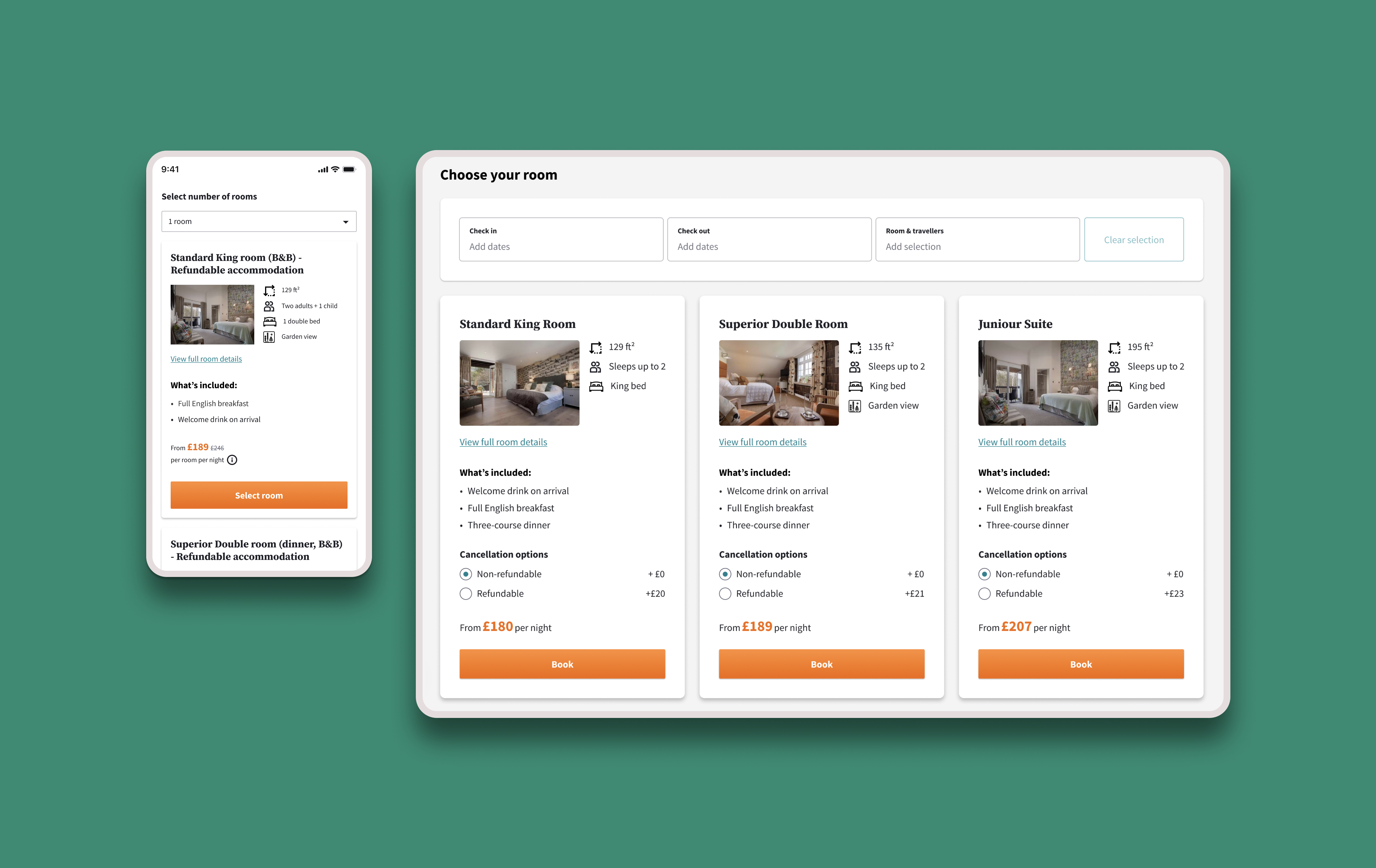
5. Design & prototype
The biggest changes proposed concerned the information architecture and content design of the page. At the same time as the redesign, there was a separate initiative well underway — transforming our front end into react. This meant there were multiple check-in points across the teams to ensure that we are aligned and the design language system is kept consistent even with the proposed changes.
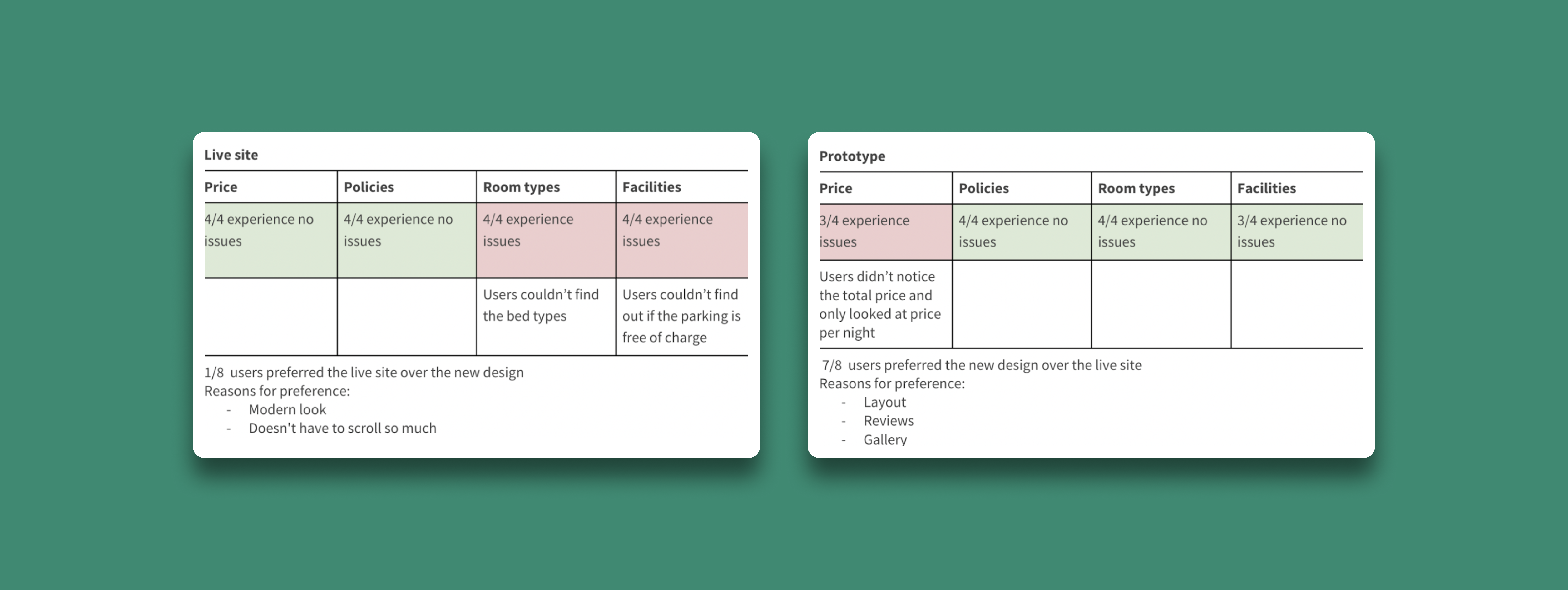
6. Test
Our goal was to understand if the new design is helping resolve the previously observed pain points, so the test consisted of two key components: Completing tasks; Stating preference over the current product page vs new product page. When presented with both websites, users expressed a strong preference for the new design. Even the users who knew Secret Escapes and reacted positively to the name, in the end, chose the Holiyay brand because of the better layout and overall experience that they had with it.